The Eponymous Pickle Blog
"The Eponymous Pickle Blog" delves into a comprehensive review of the EPIC Systems' Trend Compass, a data visualization gem that has caught the author's attention. The blog post presents an in-depth analysis of Trend Compass
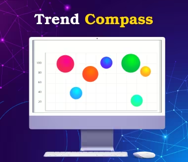
I was just sent a promo piece by Epic Systems on their visualization system called Trend Compass. With a brief examination, it creates bubble charts and includes a time slider on the X Axis that allows you to control a simple time animation. Nice for some kinds of time-dynamic data. You could argue that it over complicates data presentation when that is not needed. Worth a look. Here an example I liked on US employment and another on the stock market.
The concept of Trend Compass introduces a new way of viewing statistics and trends in an animated manner, displaying five axes (X, Y, Time, Bubble size & Bubble color) in a single chart instead of the traditional X and Y axes. This unique approach opens up new possibilities for analysis, research, and presentations. It is noteworthy that even in the banking sector, Deutsche Bank New York is utilizing Trend Compass as one of its valuable clients.
For more in-depth insights and exploration of EPIC Systems' Trend Compass, check out ,"The Eponymous Pickle Blog" .